|
|
Post by Tiana, eh? on Aug 21, 2006 21:51:37 GMT -5
 That be the current sig of yours. This is one of the few times I've seen a watercolor filter work out all right on a signature, so I'll give you, for my love of the color balance (even if I still hate the filter as a general rule) 7/10. I have a personal love for the use of the basic serif fonts like TNR and Baskerville on a signature, and the colors are sweet. Yup. |
|
|
|
Post by Padawan goober-shadowslayer on Aug 23, 2006 8:42:14 GMT -5
 I like how all of the people flow, and I like how the colors flow. But I am not a big fan of the text. The ones that I can't even read. But I think tat it deserves a 7 all together. |
|
|
|
Post by Tiana, eh? on Aug 23, 2006 21:30:42 GMT -5
Yeah, I've had that one for a while anyway... there's just no graphic's program on this computer.   6/10. I'd give it more if Mace was over to the right a bit more, and the text was just... easier to read. I'm not trying to be mean or anything, it just looks grainy. Ask anyone on Jedi.net, my biggest complaint is ALWAYS text placing. I know my text is hard to read, but that was the effect I wanted because the original text was in Japenese and it was a fandom signature. Yours should be easy to read, and... just looks crammed in there. I'd do an animation so it just had one line at a time, the stuff flashing over it, maybe. Or the three pieces on one line, a smaller text, and the other pieces bigger on one line below it. Try adding a darker or lighter border, and you'll have a great sig.  |
|
|
|
Post by Ali Blue on Aug 24, 2006 19:27:39 GMT -5
your sig's great, as usual, T.  I'll give it an 8.9. |
|
|
|
Post by Dûncariel is Dead. on Aug 26, 2006 10:19:15 GMT -5
 *snicker* For hillarity's sake, you get an eight. heh. |
|
|
|
Post by Tiana, eh? on Aug 30, 2006 15:35:29 GMT -5
 Right. Um, it'd be a lot better of a signature if the text was readable. I like the layout and the text placing... I'd give it a one pixel border, though, and again. Make the text readable. 7/10. I experimentally ran it through a filter... darkened the midtones a bit and upped the highlights... and it looked a lot more readable. If you experimented with that on one layer and an eraser between the two, it might be more ledgable and a bit more high contrast. More evil looking. |
|
|
|
Post by Dûncariel is Dead. on Sept 2, 2006 19:46:22 GMT -5
Heh. Thanks. Wish I had the time to screw around with photoshop, at the moment... note the lack of sig change for what? Three months? Yeah....  I like it. I'm not going to critique it, because I've spent the last week critiquing everything in AP English. I sort've like just saying "I like it", instead of "The colors and the text are harmonious for this reason, this reason, and this reason, though the position of such and such a flower is minorly distracting from the central theme. The text placement causes such and such a thought pattern that adds this this and this emotional change in the flow of the piece...." Gah. Nine. |
|
|
|
Post by Tiana, eh? on Sept 2, 2006 20:09:12 GMT -5
I'm going to run out of your sigs to crit, you know, if you don't HURRY UP AND GET SOME NEW ONES. Or, you know, just stop continually being the poster above me.   We'll sum it up by saying that I have always absolutely ADORED this signature. Don't like the top text placing, but it fits the signature well enough... I'd almost have used it with no text. 8.8...9...eh. In that range. Ever notice that I love critiquing? Heh. And, as for mine, the flower was unfortunately the background of the entire piece, and the essential beginning, so it's unremovable without redoing the entire thing, and it wouldn't have worked without the flower anyway, due to my method. Heh. (but 9 doesn't mean it's bad. 9 is good. Snrk.) |
|
|
|
Post by Dûncariel is Dead. on Sept 2, 2006 21:01:09 GMT -5
Unless you spell it 'neine'. Then you have no. *snrk* I suppose I could pull out a random ancient one that fits my name.... sig, that is. I'm tired of the randomizer, at the moment... [/minorly off topic] Or you could quit being the poster below me.... gosh. *grins* I really like that sig, though. Just if the flower was, say, a tiny bit more to the right... 'kay. To keep as on topic as possible....  Cracks me up. Since it's your forum, and all. Yeppers. 6.022 x 10 23 . Yay for Avogadro... |
|
|
|
Post by Padawan goober-shadowslayer on Sept 3, 2006 9:49:38 GMT -5
 I like the text and the background. It is a little blurry in a few places, But I like it. I will give it a 7.5 |
|
|
|
Post by Ali Blue on Sept 3, 2006 17:59:26 GMT -5
 I'll give it an 8.5. I like the lighting but I don't really like the Tidus pic. Good job  |
|
|
|
Post by Dûncariel is Dead. on Sept 4, 2006 16:04:17 GMT -5
 So, question. Are those fingers? If so, that's kinda creepy. Reminds me of the weird lady in Spirited Away, for some reason. Creepy. 6ish. |
|
|
|
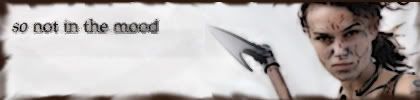
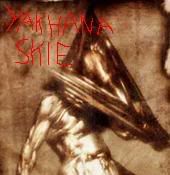
Post by Padawan Yakhana Skie on Sept 4, 2006 17:36:57 GMT -5
 My very first sig guys. Go easy. I just resized a picture and added text. Personally I would give it a 2/10 haha. I can get better guys. Just wait! |
|
|
|
Post by Tiana, eh? on Sept 4, 2006 17:44:34 GMT -5
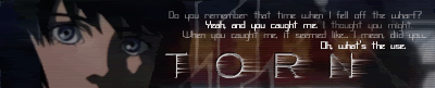
 I... can't read the text. I wouldn't mind this had you just used the script font, and left out the one word in another font, but it doesn't fit where you positioned it. I give you extra points for the two people, where you can only really see one at a time, and it's all nice and illusion and dreamy. 7.5. Pretty, but could use a bit more work. No idea what the picture is, and so it weirds me out. Your name could've been a bit bigger, too. 5/10. We wait, yes... And your HP sig... I hate HP as it is, but the layout is good, I just don't like the sideways text. 6.5/10 |
|
|
|
Post by Ali Blue on Sept 5, 2006 0:03:06 GMT -5
((the pic in my sig is actually a daisy... i'll have to change that))
|
|
|
|
Post by Barnzo on Sept 5, 2006 11:56:32 GMT -5
I like the layout... I like the light... I like it. You will find that I'm not the best at critiquing. XD But it seems lightsidish. And you claim to be a darksider. I think you make a better lightsider, personally... The only problem with it is it doesn't have enough pics on it. (?) I give it a 7.1 And Tiana made me a new sig!! (Thanks again, Tiana! ) |
|
|
|
Post by Dûncariel is Dead. on Sept 6, 2006 20:45:56 GMT -5
I likes the sig. And the funky elfish (not the lack of a v.... ) person on the left. 8.23.
Oh, thank God. I was worried.
|
|
|
|
Post by Ali Blue on Sept 7, 2006 20:46:17 GMT -5
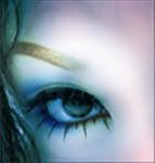
I changed it to... a butterfly! Not the traditional, I know.. but that's why I did it. I love this sig!!! It's so cool! The colors in the hair and face are awesome. I also like the different fonts on the text. It's really good. I'll give it a 9.5. |
|
|
|
Post by Padawan goober-shadowslayer on Sept 10, 2006 18:22:49 GMT -5
 I like how the colors correspond. It is a little ordinary, though... I give it a 7.2 |
|


 I'll give it an 8.9.